

finding a job
cover letter

Your resume gets about six seconds before someone decides whether to keep reading or move on [1]. From sixteen years on the recruiter side of the desk, I'd say that's about right, and on a busy day it might be generous.
The truth is that most of the experienced professionals I work with don't have a content problem. Their experience is strong. What tends to let them down is how that experience is presented. The format gets in the way. A senior operations leader with twenty years of accomplishments shouldn't be passed over because their resume is harder to read than a junior candidate's, but it happens constantly, and the frustrating part is it's almost always fixable.
What follows are the ten formatting decisions that actually matter in 2026, based on what I've seen influence hiring outcomes across thousands of applications.
This is probably the question I get asked the most, and the answer depends on where you are in your career and where you're applying.
The one-page rule gets repeated a lot, and for early-career professionals it makes sense. If you've got five years of experience, you shouldn't need more than a page. What this means is that everything on that page should be earning its place, and if something doesn't directly support your candidacy, it probably shouldn't be there.
For mid-career and senior professionals, the reality is different. If you've got ten to twenty years of progressive experience, trying to squeeze that onto one page usually means cutting the detail that actually differentiates you. Two pages is perfectly acceptable. In some markets, particularly the UK, parts of Europe, and Australia, two to three pages is standard for senior roles and nobody thinks twice about it.
The real question isn't how many pages your resume should be. It's whether everything on it is working hard enough. What I've noticed is that the last ten years of your career tends to be what matters most. If your most recent roles are strong and clearly presented, earlier experience can be summarised briefly or grouped together. The key is giving the most space to the roles that are most relevant to where you're heading next.
Part of the reason this matters is that recruiters read from the top down, and they don't always make it to the bottom. Your most important content needs to be where it'll actually get seen.
A senior professional's resume should look and feel different from a graduate's. Not just in what it says, but in how it's structured and the confidence of its presentation.
What I mean by that is your resume should make someone's job easy. When a recruiter picks it up, they should be able to tell within a few seconds what level you operate at, what kind of work you do, and whether you're worth reading further. That's the job your opening section needs to do.
The professionals who get this right tend to lead with a strong career profile: two to four sentences that establish who you are, the environments you've worked in, and the kind of value you bring. This isn't a career objective telling the employer what you want. It's a clear positioning statement that tells them what you offer.
After that, I recommend including three core capabilities, each backed by a brief example that brings it to life. Rather than just listing "stakeholder management" as a skill, you might write something like: "Stakeholder management: Led a cross-functional steering committee of twelve senior leaders through a $4M systems integration, aligning competing priorities across four business units." That specificity is what separates a senior resume from a generic one.
What this does is front-load your resume with evidence. The person reading it doesn't have to dig through three pages of role descriptions to understand your value. They get it immediately, and then your detailed career history backs it up.
The order of sections on your resume shapes how people read it, and that matters more than most candidates realise.
The structure I use with my clients puts the career profile and core capabilities at the top, followed by a career summary that gives a quick overview of roles and dates, then education and professional development, and finally the detailed career history.
The reason for this order is practical. It gives the recruiter a fast path through your resume. They can read your profile and capabilities in thirty seconds and know whether you're worth a deeper look. The career summary gives them the trajectory at a glance. And then the detailed history provides the evidence for anyone who wants to dig in.
What I've noticed is that many professionals put their detailed career history right at the top, which means the reader has to work through multiple role descriptions before they understand your overall positioning. By the time they piece together who you are, they've already spent more time than they wanted to, and in a competitive process that works against you.
We're also seeing that education placement depends on your level. If you're early in your career and your qualifications are your strongest asset, put them near the top. If you've got fifteen years of experience, your education supports your credibility but it's not the headline. Put it after your career summary and before the detailed history.
There's a lot of anxiety about applicant tracking systems, and I think much of it is misplaced. Let me share what I've actually observed from the recruiter side.
ATS platforms attempt to parse your resume into structured fields and then score it against job requirements. Recruiters often see candidates sorted by these match scores. The truth is that the scoring isn't that good yet. It cherry-picks keywords and tries to match them, but it doesn't understand human context [2]. I regularly find that profiles with low ATS scores are actually exactly what I'm looking for, and high-scoring profiles sometimes miss the mark entirely.
What this means in practice is that most recruiters I know don't just look at the top-ranked candidates and ignore everyone else. We still review the full applicant pool. The ATS is a tool for organising applications, not a reliable filter for quality.
So should you ignore ATS altogether? No. There are some basic things worth getting right. Use standard section headers like "Experience" or "Professional Experience" rather than something creative like "My Career Journey." Avoid putting critical information in headers, footers, or text boxes, because those elements can get dropped during parsing. And submit as a PDF unless the posting specifically asks for something else, because PDFs preserve your formatting consistently.
But the idea that using two columns will get your resume rejected, or that adding a touch of colour will confuse the system? That's largely outdated. Modern ATS platforms handle these things much better than they did five years ago. What I'd encourage is to worry less about gaming the technology and focus more on making your resume clear and compelling for the human who's going to read it. That's where the decision actually gets made.
When a recruiter picks up your resume, they need to find what they're looking for without having to work at it. The truth is that elaborate graphics, infographic-style layouts, and multi-column designs create more problems than they solve, not primarily because of ATS but because they slow down the human reader [3].
What works is straightforward. Consistent spacing. Clear section headers. A single-column layout that flows logically from top to bottom. Your name and contact details at the top. Your career profile next. Then your experience, formatted consistently for each role.
Subtle design touches can work well. A single accent colour for section headers, a horizontal line between sections, consistent fonts throughout. These keep things professional without introducing anything that distracts from your actual content.
Part of the reason this matters is volume. On any given role, a recruiter might be reviewing fifty to a hundred applications. Anything that makes your resume take longer to parse than the next one is a disadvantage. I've reviewed resumes where finding someone's job history meant scrolling past elaborate header graphics and skill visualisations. By the time I located the actual experience, I'd already spent more time than I would on three straightforward applications. The person's qualifications were solid, but the presentation worked against them.
White space is not wasted space. It's what makes your content readable. Standard margins of half an inch to one inch, adequate spacing between sections, a clean visual hierarchy. These things signal that you've been intentional about how you present yourself, and that matters.

This is the single biggest issue I see on experienced professionals' resumes. People describe what the job required instead of what they actually accomplished. Your resume shouldn't read like a job description. It should show what changed because of your work.
The difference matters more than most people realise. "Managed a team of sales representatives" tells me your job title. "Built and led a twelve-person sales team that exceeded quarterly targets by 23% for six consecutive quarters" tells me what you can deliver. That second version gives someone a reason to pick up the phone.
What I tell my clients is to think about each role and ask: what was different after I was there? Revenue generated, costs reduced, time saved, team size, projects delivered, satisfaction scores improved. If you led a team, how many people? If you increased sales, by what percentage? If you improved a process, what changed as a result?
Rather than talking about your responsibilities for undertaking complex negotiations, discuss a particular complex negotiation you undertook and what the impact for the organisation was. That's where the real value comes through.
For each role, aim for five to seven key achievements. Use strong action verbs: led, built, launched, negotiated, redesigned, implemented. And make sure every bullet answers "so what?" If you led a project, what happened because of it? The result is what matters.
If exact figures aren't available, estimates work. "Reduced processing time by approximately 30%" is much stronger than no number at all. You can use "approximately" or ranges. The point is to give the reader something concrete to hold onto.

Keywords still matter for ATS matching, but the approach has moved well beyond stuffing them in wherever you can. What we're seeing now is that modern systems look at context: how keywords appear within your resume, not just how many times they show up.
A resume that mentions "project management" fifteen times without any evidence of actual project management will score worse than one that uses the term twice alongside clear supporting accomplishments.
The most effective approach is natural integration. Study job postings for the types of roles you're targeting and identify the specific language they use. If multiple postings mention "cross-functional collaboration," that phrase should appear in your resume, backed by a specific example of when you did it.
What this means in practice is showing the keyword in action rather than dropping it into a list. Rather than adding "budget management" to a skills section, show it working: "Managed $2.4M departmental budget, reducing costs by 12% while maintaining service levels." That satisfies the ATS and gives the hiring manager something concrete to evaluate at the same time.
And that matters because the recruiter who reads your resume after the ATS scores it is looking for evidence, not keyword density. They want to see that you've done the work, not that you know the right words.
Objective statements were standard decades ago but they've been replaced for good reason. "Seeking a challenging position where I can utilise my skills and grow professionally" tells the reader nothing. It's about what you want, not what you offer, and it applies to literally every candidate.
A professional summary does the opposite. It immediately positions your value. The truth is that your summary is often the only section that gets read in full on the first pass, so it needs to work hard.
Keep it to two to four sentences. Establish your level, your area of expertise, and the kind of value you bring. Something like: "Operations director with twelve years leading distribution teams across three continents, specialising in cost reduction initiatives that have delivered $4.2M in annual savings." That gives the reader immediate context for everything that follows.
The key is specificity. If your summary could describe anyone in your field, it's too generic. The strongest summaries name the specific thing you do better than most, backed by at least one number that shows scale or impact.
If you want to go deeper on writing a strong summary, I've covered that in detail in How to Write a Resume Summary.
Some of the most common issues I see aren't about strategy at all. They're the small things that create friction before anyone has properly evaluated your experience.
Contact information that works. Your phone number, a professional email address, and a LinkedIn URL form the standard contact block. Make sure all three are current. If your email address dates back to college with something creative in it, set up a simple one using your name. It's a small thing, but it shapes first impressions. And make sure your LinkedIn profile is a customised URL, not the default string of numbers, and that it adds context beyond what's on your resume.
Spelling and grammar. One typo won't disqualify you, but multiple errors signal carelessness, particularly for roles involving written communication or attention to detail. Spellcheck catches obvious errors but misses context problems: "manger" instead of "manager," words spelled correctly but used in the wrong place. Read your resume aloud. Have someone else read it. Print it and check the physical copy, because errors often jump out more on paper than on screen.
File format. Submit as a PDF unless the posting specifically asks for something else. PDFs preserve your formatting across systems and print consistently. Name the file professionally. "Sarah_Chen_Resume.pdf" rather than "Resume_Final_v3.pdf."
Font choice. Stick with clean, widely available fonts: Arial, Calibri, Georgia, Garamond. Body text at 10 to 12 points, your name slightly larger. Going smaller than 10 to fit more content in backfires. It makes the document harder to read and gives the impression you couldn't prioritise your information.
Sending the same resume to every job is efficient. It's also a reliable way to hear nothing back. The reality is that each application should read like a direct response to that specific opportunity.
This doesn't mean rewriting your entire resume for every job. It means adjusting what you emphasise. When a job description focuses on team leadership, your team leadership work should be front and centre. When it emphasises technical skills, those should be easy to find. Your core content stays consistent, but the emphasis shifts.
What I'd suggest is maintaining a master resume with everything on it: all your roles, all your achievements, all your skills. It might be three or four pages. Don't send this to employers. It's your source material. From that master, build base versions for each type of role you're targeting, and then make targeted adjustments for each application. Update your summary, reorder your achievement bullets, adjust your skills section. This should take fifteen to twenty minutes per application.
A focused search with twenty well-tailored applications usually beats a scattered approach with a hundred generic ones. Your experience matters. Tailoring just makes that value visible to each employer in terms they understand.
I've written a more detailed guide on this: How to Tailor Your Resume for Each Job.
The formatting decisions covered here are the ones that actually influence hiring outcomes. Not because they're trendy or clever, but because they're based on what I've watched work across thousands of applications over sixteen years.
Clean layouts that respect the reader's time. Achievements that show what changed because of your work. A structure that signals your level immediately. Keywords shown in context rather than stuffed into lists. These fundamentals haven't changed, even as the technology around them has.
Your resume should make your level obvious quickly. When your formatting works well, the person reviewing it spends their time evaluating your qualifications rather than trying to decipher your document. And that's where the decision actually gets made.
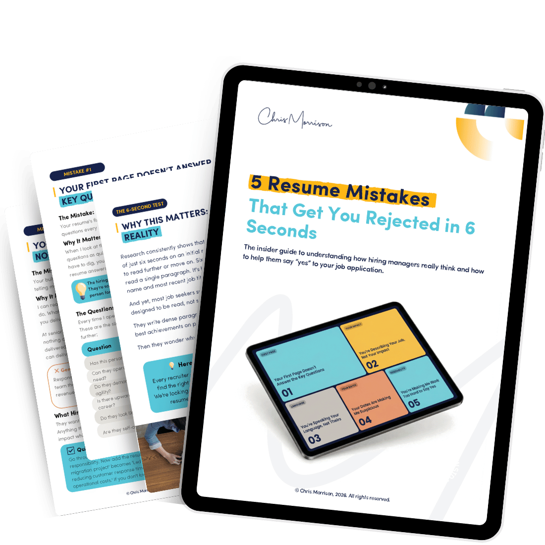
Most candidates make the same five mistakes that get resumes rejected in seconds. Find out what they are.
[1] Rowan, J. & Cibin, A. (2023). "Application Review Times and First Impressions in Recruitment." HR Research Institute, Society for Human Resource Management. Findings indicate recruiters spend an average of 5-8 seconds on initial resume review.
[2] Jobvite (2024). "2024 Recruiter Nation Report: ATS Systems and Resume Parsing." Technical analysis of resume compatibility across 50+ major ATS platforms, documenting formatting-related parsing failures in 23% of submissions.
[3] Kacso, K. & De La Rosa, C. (2023). "Machine Learning in Applicant Tracking: Context-Based Keyword Evaluation." Journal of Applied Human Resources Technology, 18(2). Research on modern ATS algorithms demonstrates keyword density no longer correlates with ranking; contextual relevance is primary driver
